
F&F
F&F is an e-commerce platform designed around a single question: how few steps can there be between finding a product and owning it? We designed the navigation, the product pages, and a checkout flow that removes friction instead of explaining it away.
— The Challenge
F&F needed an e-commerce design where the product does the selling. That put three things on the table: navigation that survives a large catalog, product pages where the item is legible before it is described, and a checkout short enough that nobody reconsiders halfway through. This was a design problem, not a development one, so the interface had to earn the sale on its own.
— The Solution
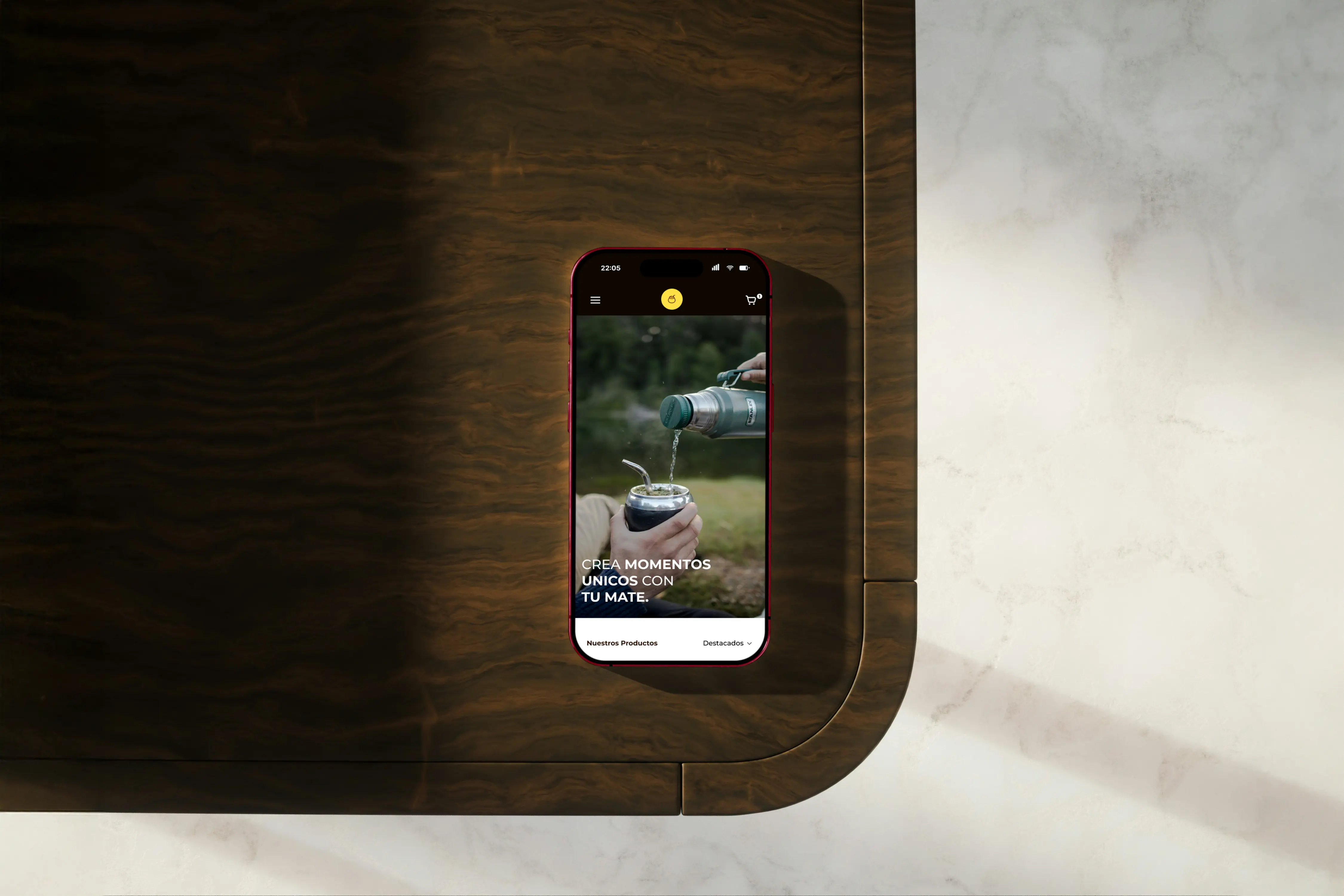
We designed the storefront around the product image. Category and filter navigation stays reachable at every depth, so browsing a large catalog never turns into a series of dead ends. Product pages lead with large, uninterrupted visuals and place specifications below the decision rather than in front of it. The purchase flow was compressed into one continuous checkout with visible progress, so a buyer always knows how much is left. Every layout was designed mobile-first.
— The Process
We worked in the order the problem demanded: research first, to understand how people actually shop this category, then wireframes to settle structure before anyone could argue about color, then high-fidelity screens and a prototype to walk the flow end to end. Structure was locked before surface, so the visual design had a skeleton to sit on instead of holding up the layout by itself.




Key features
- 01Intuitive navigation system
- 02Enhanced product visualization
- 03Streamlined checkout flow
- 04User-centered design
- 05Mobile-responsive layouts
- 06Conversion-optimized UX
The Result
The result is an e-commerce interface that carries a shopper from discovery to checkout without a detour: navigable at any catalog depth, legible on a phone, and short where it counts. The full design is published on Behance.